Since the first Academy Award for Best Animated Feature was awarded in 2002 to DreamWorks’ Shrek, the animation industry has made incredible strides. This awards season, such films are pushing the boundaries of what animation can be, and VFX plays a huge part in infusing new artistic styles into every frame.
Spider-Man: Across the Spider-Verse pushed the animated comic book style of the 2018 film even further with six new, distinct worlds and a visually complex villain. Nimona eschews depth of field for “depth of detail” to give a graphic-novel quality to its medieval future. Teenage Mutant Ninja Turtles: Mutant Mayhem integrates 2D elements in a 3D space to fight against the clean CG look.
Read the full article on Deadline’s website here.
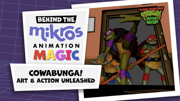
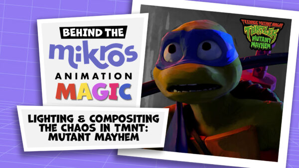
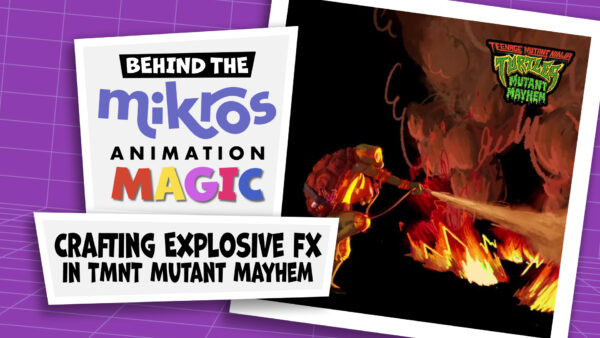
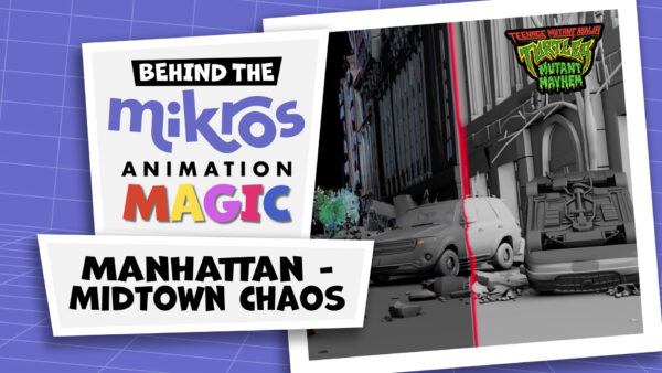
- Teenage Mutant Ninja Turtles: Mutant Mayhem
For Teenage Mutant Ninja Turtles: Mutant Mayhem, the filmmakers wanted to focus on the teenage aspect of the characters, in both the story and artistic style. Mikros Animation was the main animation studio for the film, and VFX supervisor Matthieu Rouxel began working with director Jeff Rowe on creating a unique style. “From the beginning, Jeff had really great ambitions for the visuals of the movie,” says Rouxel. “One of the first references we had was a sheet of drawings made by actual teenagers. It was cool, not super artistic, master drawings, and that was the spirit they wanted to have.” In addition to those drawings, Rouxel says they had more sophisticated references as well, like the approach to light and color in Alex Webb’s photography of New York City. “For me, it was a mix of those two things that really make this movie unique.”
Although 2D elements play a large part in the artistic style of the film, CG was still crucial to the animation. “I’ve been working in CG movies for years, and I was always trying to break that nice, clean 3D aspect, and try to get back the vibe of something more 2D-driven and more artistic.” Rouxel says that about 95 percent of the film is made in 3D, even the pencil lines that create shading and details were made in CG as part of molding each character, though they appear to be 2D.
There was no easy solution to breaking the clean CG look, as Rowe didn’t want the stylization to be done through a final filter on the film. “From the very beginning, there are a few things you try to do,” says Rouxel. “First, you create asymmetry in the models—the eyes don’t have the same size, the shoulders are not the same, the cheeks are different.” In addition to the asymmetry, they created the models with a clay-like texture and created curving lines with the thickness of an actual pencil to give the feeling of 2D art.
Warning: Invalid argument supplied for foreach() in /mnt/efs/hosts/www.mikrosanimation.com/uploads/cache/0e538f8f2e03d824bca7ff8b8a87f65c1712ea2c.php on line 9
Another strategy used was forbidding the use of real textures, which meant that the team creating textures had to start from scratch for every asset. “Then, the lighting would be applied normally, but there were a lot of features in the shader.” The shader would be used separately on each light source, to give the appearance of painted lights and shadows. “The compositors would also craft their own materials to put a texture on top of the picture, mixing it with texture projected in 3D, so it is not just smooth and clean.”
Thanks Deadline!